Monday, June 17, 2013

Special effects stickers

There were all kinds of special visual effects that stickers offered in the 1980s. They quickly evolved from two-dimensional decorative seals to collectors' items with a range of sensory bells and whistles: puffy, fuzzy, scratch and sniff, shiny, sparkly...

And the eighties were a time of special visual effects. You could get sneakers with "oily" rainbows on the side, wear fluorescent clothing, and affix glow-in-the-dark stars to your ceiling. The time was ripe, I think, for stickers that could be marketed as "opalescent":


So pinky and pastelly, too. And let us not forget holograms!


A scientific brainchild of the 1980s [note: actually 1968], holograms combined rainbow and 3-D effects in one. So cool. We've got balloons, unicorns, bears, James Dean, and Marilyn Monroe...

The greatest special effects stickers were probably liquid crystal (or "oily"). Some of my oilies have aged; you have to periodically massage them to keep them fresh.


Finally, check out the awesome heart--I am not sure what you'd call it, if it's not holographic. Here is the view at an angle:


The three-dimensional pattern appears to extend into infinity; the image actually changes with the viewpoint of the observer. Such a space-agey, computer-graphics inspired take on your classic heart sticker. Like Tron meets Hallmark or something.


Saturday, January 26, 2013

Edward Gorey


I love Edward Gorey, and I love stickers. So you can imagine my elation when this winter I stumbled across this:

Who knew such a thing existed?!
I bought a couple of copies, one to keep, and one to use. Here are some highlights:


Cute Farm Animals!


Saturday, November 3, 2012

Catching up

Wow, I have fallen behind in my sticker blogging. Time to catch up.

One highlight of my fall was a trip to Russia back in September. You wouldn't think that Russia is a great sticker-shopping venue, and for the most part you would be right. But then I found these stickers at a souvenir shop:


Seriously, these are like the most adorable stickers I've seen all year.


And I bought them without giving it a second thought. Sorry to report, I'm kind of happier with puffy, colorful nesting-doll stickers than I would be with actual nesting dolls.

The other notable sticker acquisition this fall is a group of puffy Hallmark stickers made for teachers to give out to their students at Halloween and Thanksgiving time. My dear friend Amanda, also a sticker collector and a teacher, found them and purchased them with the understanding that when things are this corny they circle back around and become hilarious again, and that I should absolutely have them:

These have a kind of nostalgia factor, since I remember getting encouragement stickers from my teachers back in the 1980s.

"Gourd job" is a stretch; "You Rock" is probably the best one. And "Good Gravy" is just as cute as can be.

Happy fall!

Saturday, February 18, 2012

Mary Engelbreit v. Lisa Frank

I think because I was younger and more impressionable in the eighties, I have more of a soft spot for 1980s nostalgia (Michael Jackson, Family Ties, leg warmers) than I do for 1990s nostalgia (Julia Roberts, Lilith Fair, dress clips). I put this to the test going through my Mary Engelbreit stickers. Let me make it clear that I love her work as an illustrator, but some of her concepts are whimsical and nonsensical in a way I don't really get.


I mean, I do get it: chair of bowlies. Cute. I might like it better without the caption.


 Princess of Quite a Lot. Okay. Like of nail polish and cake?

Many of her designs seemed targeted toward suburban, middle-aged women who enjoyed gardening, tea, and platitudes.


These are just adorable illustrations. For some reason the words and overall themes don't grab me. I wonder if I'd be more into them if I'd been introduced to concepts like "time for tea" when I was twelve.


The reason I wonder this is that I was super-into Lisa Frank, whose airbrushed designs scream commercialism, whose colors are garish and whose designs make no sense at all. Granted, Lisa Frank was marketed at kids and Mary Engelbreit at readers of Victoria magazine, but still. I understand the appeal of Lisa Frank, even today.


Yes!  A bear on a rainbow ice cream cone! Clouds raining hearts! Lands made up of junk food!

 I don't need to take mushrooms to accept at face value cats embracing rainbow moons, oversized clowns with unicorns in their hands, or tropical birds hanging on upside-down rainbows in the sky. Nope, no explanation needed.

Perhaps I just have a preference for the rococo, but it's also true that my tastes in 1986 were unsophisticated and, as a results, my standards for excellence were lower then.

Loved it.

So I have to wonder if my preferences are skewed as the result of my age. Or is Mary Engelbreit simply too grown-up and wordy?

Saturday, February 4, 2012

Product Placement

For many years when I was growing up, my sister and I weren't technically allowed to watch commercial television. Except that we did; I got to watch Captain Kangaroo, and by the time I was seven or eight, we had cable and my mom had given up trying to prevent us from watching tv. 

But when I was very young, I was impressionable, and  now that I think about it, there was some seriously aggressive marketing going on. Would you let your preschooler watch tv when this is what she saw during the breaks?  Crazy Cow cereal. Rub-a-dub dollyCoke. Weebles Treehouse. Holy crap, I needed these products! Coke could bring world peace, change your day for the better--and why wasn't I allowed to drink out of a bottle, anyway?!

Product placement, specifically targeted towards children, seems to have continued into my sticker collection, but by the 1980s I was a little bit less impressionable.


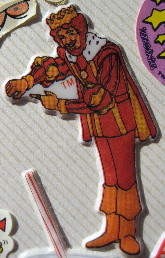
Why Burger King is pointing at his wrist when he isn't wearing a watch is beyond me. Is he trying to tell us it's "time" to go to Burger King? Or is this something infinitely more perverse?
I do remember consuming a lot of Bubble Yum and Whopper, Jrs. in middle school though. Hmm.